Click here to download printable versions of these notes in PDF format
The colour spectrum
The visible spectrum of colours that we can see ranges between red at one end and violet at the other end. This is what we see when we look at a rainbow. Although the colours in fact gradually change from one to another as you move through the spectrum we could say that there are six noticeably different colours. These are red, orange, yellow, green, blue and violet.
Arranging hues in a colour circle
It will be noticed that the two ends of the visible spectrum have some similarity since violet has a reddish look about it. So by joining the two ends of the spectrum together we can make a circular arrangement of colours. This diagram is known as a colour circle or colour wheel. Each of these colours around the circle is called a ‘hue’.

Hues arranged in colour circle
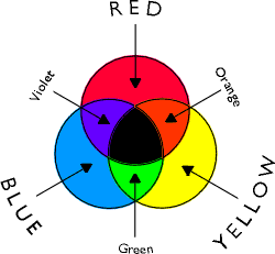
Primary, secondary and tertiary colours
If we are going to create these colours from mixing paints or pigments then some of the colours will be found to be more important than others. This is because whereas some of the colours in the spectrum can be made by mixing you cannot mix a pure red, yellow or blue. For this reason red, yellow and blue are called primary colours.
However it is possible to mix orange (from red and yellow), green (from yellow and blue) and violet (from blue and red). Orange, green and violet are therefore called secondary colours. You will notice that on the colour circle the secondary colours come between the primary colours that could be used to mix them. For example orange comes between red and orange and could be mixed from these colours.
Of course you could divide the colour circle into as many segments as you like, each one only slightly different from the next. For example, you could have a colour called ‘red-orange’ between red and orange. These ‘in-between’ colours are sometimes called ‘tertiary’ colours although the word can also have other meanings in terms of colour.
Complementary colours
The best way to make a colour really stand out is to put it next to another colour that is completely different from it. The differences between the two colours will then be very noticeable and each one will appear to be emphasised. Such pairs of colours are known as ‘complementary colours’
For colours to be different as possible from each other they need to have completely different ‘ingredient’ colours. For example the colour that is most different to green is red. Green can be said to be a mixture of blue and yellow but a true primary red has no blue or yellow in it.
One advantage of arranging colours in a circular diagram is to show what the complementary of each colour is. On the colour circle complementary colours are arranged opposite to each other. For example red is on the opposite side of the circle to green.
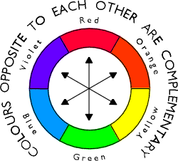
Colour circle showing complementary pairs of colours
The contrast between complementary colours can be seen in nature, where many berries and fruits are red so that they stand out against the green of the foliage, attracting birds to eat and spread the seeds.
Differences in lightness and darkness between hues
If you look at the ‘hues’ on the colour circle it is obvious that some (e.g. violet) are dark in themselves, whilst others (e.g. yellow) are light in themselves. The colour circle can be seen as being divided into a darker half (centred on the violet) and a lighter half (centred on the yellow). Putting together areas of violet and yellow will therefore result in a contrast of dark and light colours as well as a contrast of complementary colours.
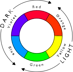
Colour circle showing dark and light colours
Dark colours tend to be stronger than light ones. You need to be careful therefore when a adding a dark colour to a light one. For example when adding red to yellow to make orange a very small amount will very quickly stain or darken the yellow. Add the darker colour gradually until you have the mix you want.
Warm and cool colours
Another way of looking at ‘hues’ is to see them as ‘warm’ or ‘cool’ colours. The colour circle can be seen as being divided into a warm half (centred on the orange) and a cool half (centred on the blue). If a warm and a cool colour are placed next to each other the difference between them in terms of warmth or coolness will be more apparent. Putting together areas of orange and blue will therefore result in a contrast of warm against cool as well as a contrast of complementary colours.
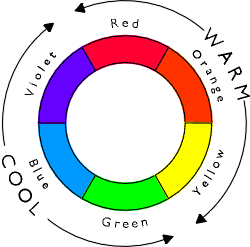
Colour circle showing warm and cool colours
The choice of the dominant colours in a composition will have a major effect on the way that the work looks when finished. A painting consisting predominantly of blues will have a cool, reflective or melancholic feel. On the other hand a picture consisting mainly of red, orange or yellow will tend to produce a hot, busy, or happy feel.
The colours used in printing
When pictures are reproduced in colour in books and magazines for example three colours are used: magenta (a pinkish red), cyan (a turquoise blue) and yellow (a lemon yellow). Each colour is printed separately on top of the last one (In fact a black printing is added as well to give the necessary depth in the dark tones). By varying the density of these layers any colour can be reproduced. Primary colours approximating to these colours are now available in some types of painting media such as gouache.
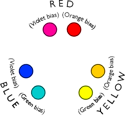
Choosing a palette of primary colours for colour mixing
Although in theory secondary colours can be mixed from primaries, this will only work perfectly if true primary colours are used. In practice it is not easy to find a red, for example, that will make both a good orange (when mixed with yellow) and a good violet (when mixed with blue). This is because the red may not be a true primary red but may in fact have a bias towards either orange or violet. For example a red that has an orange bias will mix a good orange, but will not mix a bright violet.
Traditionally paints have been made from naturally occurring pigments which has meant that you were limited to what was available. Today with many modern chemically-produced colours there is a much wider choice available. However it is still not an easy choice to find the right colour as a primary colour.
One way to overcome this problem is to have a palette that consists of two of each of the primary colours. For example you could have a red with an orange bias for mixing orange and a red with a violet bias for mixing violet. Such a palette might be as follows: red with violet bias (e.g. ‘Permanent Rose’ or ‘Rose Madder’), red with orange bias (e.g. ‘Cadmium Red’ or ‘Vermilion’), yellow with orange bias (e.g. ‘Cadmium Yellow Deep’ or ‘Chrome Yellow’), yellow with green bias (e.g. ‘Cadmium Yellow Pale’ or ‘Lemon Yellow’), blue with green bias (e.g. ‘Cerulean Blue’ or ‘Coruleum Blue’) and blue with a violet bias (e.g. ‘French Ultramarine’ or 'Cobalt Blue').
Colour palette consisting of two versions of each primary colour
To mix secondary colours with such a palette you would use the primary colours closest on the colour circle to the required secondary (assuming that you are trying to get a bright colour). For example to mix a green you would use yellow with a green bias and blue with a green bias.
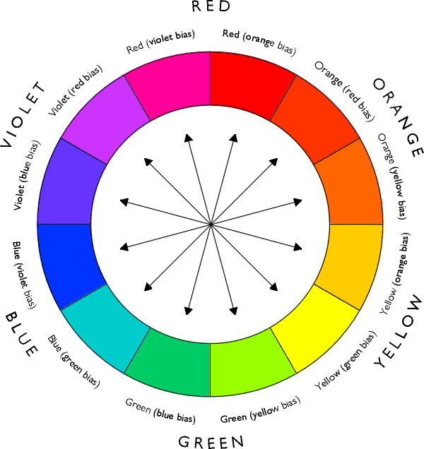
Colour circle of more hues showing complementary pairs of colours
These secondary colours can themselves be varied in hue as shown in the diagram. To vary the hue you will need to vary the proportion of the ingredient colours. For example to mix a bright green with a yellow bias you will need more yellow and less blue and to mix a bright green with a blue bias you will need less yellow and more blue. In each case the ingredient colours would be the same (yellow with green bias and blue with green bias). The only difference is in the proportion of the mix.
Other aspects to consider when mixing colours
So far we have only looked at variations in the ‘hue’ of a colour or in other words where that colour would be placed around the circumference of the colour wheel. There are however two other aspects of colour that need to be taken into account when mixing colours.
These are sometimes called ‘saturation’ (how vivid or dull the colour is) and ‘luminescence’ (how light or dark the colour is). The following sections deal with these aspects in more detail.
Colour saturation or intensity
All the spectrum colours that have been discussed so far are strong vivid colours. They could be described as being ‘saturated’ with colour or ‘intense’ colours. Obviously not all colours are like this. As a colour becomes less saturated it becomes duller, producing more ‘muddy’ looking colours such as brown. If this process is carried further there will eventually be no colour left at all and the result will be something like black.
In theory colours are made less saturated by adding black. However in practice black tends to have the effect of dirtying the colour and the results are usually not very satisfactory, particularly with yellows.
It is much better to achieve the effect by adding a colour, but one that is as different as possible from the colour in question. This is of course the complementary colour. The amount that you add will depend on how dull the resulting colour is intended to be. For example, to produce a slightly dull red (such as a ‘brick red’) you will need to have mainly red in the mix with only a small amount of green (the complementary colour) added. On the other hand to produce a dull green (such as an ‘olive green’) you will need to have mainly green in the mix with only a small amount of red added. The green in these mixes could of course be made from yellow and blue.
If the red and green were mixed in such a way that it was not biased towards either colour then the result would be a dark neutral colour something like a black. If the green was itself made from blue and yellow then in effect you would have mixed red, yellow and blue (the three primary colours) together. If you mix other pairs of complementary colours together the result will of course be similar (mixing together the blue/orange complementary pairs could be done by mixing blue with red and yellow and mixing together the yellow/violet complementary pairs could be done by mixing yellow with red and blue). So in effect the ingredient colours in the mix are the same in each case.
Mixing of black from primary colours
Although black (from the tube) is not normally recommended it can be useful when you need to get a very dark colour or black itself but even then is generally best mixed with other colours.
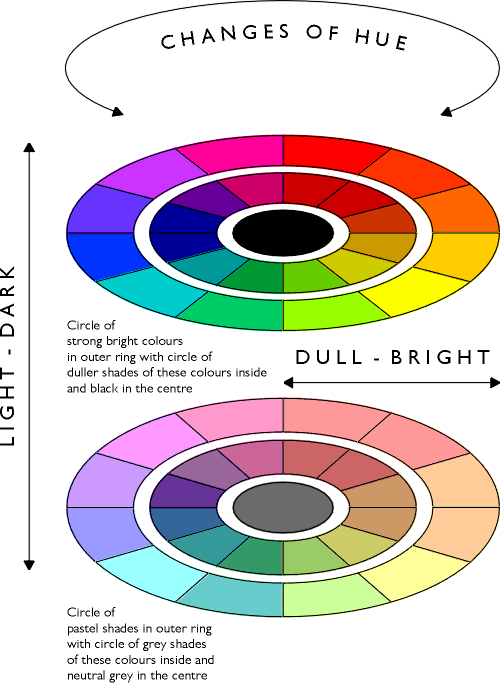
It will help if the duller versions of each colour are shown on the inside of the colour circle with something approaching black (mixed from the three primaries) in the centre. Bright saturated colours are arranged around the edge of the circle and the further you move towards the centre of the circle the duller the colour is.
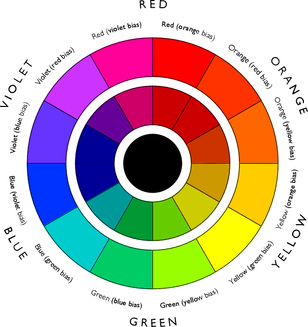
Colour circle showing bright saturated colours around the outside and duller versions of these colours inside with black at the centre
Another way of achieving a dull colour is to mix non-adjacent colours on the colour circle. For example to create a very dull green you could mix together a blue with a violet bias (such as ‘Ultramarine’) and a yellow with an orange bias (such as ‘Cadmium Yellow Deep’). In effect you are mixing across the circle (though not quite across the centre) rather than round it, so the result will be similar to other mixes nearer the centre of the circle.
Luminescence - changing the lightness of a colour
Colours can also be varied by changing the amount of lightness in the colour. The result of adding white to a colour is a ‘shade’ or ‘tint’ of a given colour. This lightness of the colour is sometimes referred to as its ‘luminescence’. The ultimate effect of lightening a colour would be to end up with pure white itself. Any hue on the colour wheel can of course be lightened in this way. For example lightening a red produces a pink and lightening a yellow usually produces a kind of cream colour.
Basically what you are doing is changing the tonal value of a colour. It is sometimes referred to as the ‘value’ of a particular colour. Getting the right tonal value is one of the most important aspects of colour mixing. To judge the tonal value of a colour you could imagine what a grey of the same tonal value would look like on a scale ranging from black to white.
This lightening of a colour can be done in one of two ways. The first option is to thin the colour down so that the white of the paper or painting surface shows through more. In many ways this technique explains most clearly the concept of luminescence with the colour becoming brighter as it is thinned. This is the normal technique with water colours where water is used to thin the colour. However it can be also be applied to other media.
The other technique is to lighten a colour by adding white to it. This is the normal technique used with most other opaque painting media such as oil, acrylic or gouache paints. It may not produce quite such a bright colour and can have a slightly different effect on the colour. However it is necessary to do this so that the colour will cover over another one which is part of the normal method of working with these media. Generally speaking, a light colour will need to be applied more thickly than a dark colour if you are trying to cover over an existing colour. This is why you will often use more of the white than the other colours when working with an opaque painting medium.
Combining saturation and luminescence
In practice many colours that you will need to mix will need to be varied both in terms of saturation (brightness) and luminescence (tone). For example a ‘sand’ colour might be a dull colour but one that is also light in tone. To mix such a colour first of all decide what is the closest hue to it on the colour wheel. This might be some kind of yellow-orange. You could mix this from red (with orange bias) and yellow (with orange bias) with more of the yellow in the mix than the red. Then make the colour less vivid by adding a small amount of the opposite or complementary colour from the colour wheel. This would be a blue with a violet bias. Finally get the right amount of lightness by adding white (or thinning the colour if it is a water-colour).
If a colour is made very dull but also light in tone then it will start to become a kind of grey. If the grey has no particular colour bias, for example if it mixed from the three primaries without being biased towards any of them, then the result will be a completely neutral grey, lacking in colour.
Again the general pattern is easier to understand if a second colour wheel is drawn like the first but this time with white added throughout. The outer ring will consist of pastel shades of each of the hues. Inside that will be a ring of duller versions of each of these paler tones (looking rather like a series of differently tinted greys) and in the centre of the circle will be a completely neutral grey.
Since colour mixing has three variables (hue, saturation and luminescence) the only really satisfactory way to show all the variations possible is in a three-dimensional diagram such as shown.
Three dimensional colour circle diagram
Click here for colour mixing exercise based on this diagram
The role of additional colours in the palette
Manufacturers make a far greater range of colours than just the three primaries, so what role do these play?
Essentially having a bigger palette of colours provides a series of short-cuts in the process of colour mixing. However even if you have every colour that is available you will still need to mix colours to get exactly the colour you want.
If you want to extend your range of colours the first thing to look at would be getting some of the secondary colours. Even with well-chosen primary colours it may not be possible to get bright enough mixes for colours such as oranges, greens or violets. This is particularly true if it is important to have very bright true colours, for example in painting flowers.
You can still use the idea of adding the complementary to dull down a colour if you have more colours to choose from. For example, instead of adding orange to blue to tone it down you could add an orange-brown. The effect would be similar but because the orange-brown is a darker colour, the resulting mix will become darker and duller more quickly.
In some ways having more colours in your palette can make the selection of colours more complex because there are more colours to choose from. It is better to get used to mixing from a few primary colours to begin with so that you understand what you have to add to get a particular type of colour.
Restricting your palette to smaller number of colours can have other advantages. The fewer the colours, the easier it is to make a harmonious composition out of them. Having too many colours in a composition can result in a picture that lacks a sense of cohesion.
Simultaneous contrast
One of the problems in mixing colours is that every colour is influenced by the other colours around it. As the composition is built up colours that were put down previously may appear to change.
In the same way as placing adjacent tones next to each other tends to exaggerate the tonal differences between them, so placing colours adjacent to each other exaggerates their differences of colour. If two blues are almost the same, the differences between them will be exaggerated if they are placed together, whereas if they are placed some distance apart, the differences may not be noticeable.
What is happening can be seen particularly well if a strong colour is placed next to a very neutral one such as a grey. Placing a strong violet next to a grey will emphasise the difference between them and make the grey appear to have a yellow tinge even though it may in reality be a neutral grey. This happens because the brain is exaggerating the difference, pushing the visual appearance of the grey towards the complimentary colour i.e. green. Conversely a bright yellow placed next to a grey, would make the grey appear to have a violet tinge.
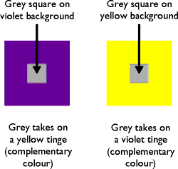
Illustration of simultaneous contrast (the two small squares are in fact identical)
Optical mixing of colours
If areas of adjacent colour are viewed from a great distance or if the areas of colours are fairly small, they can appear to merge into one another. Thus orange and magenta in close proximity may appear as red from a distance. This effect was exploited by the ‘Pointillist’ painters such as Seurat, building up the painting from individual dots of colour.
A composition that uses very similar colours adjacent to one another will appear harmonious and ‘quiet’, as they will merge together to form largely monochromatic areas. For example a landscape may consist largely of shades of green, which could visually merge together.
Naming and identifying colours
Artist's colours use the traditional names of the pigments from which the colour is made. However there can be quite considerable differences between one manufacturer or range of colours and another. Sometimes the word ‘hue’ is used when a cheaper pigment is substituted. ‘Cerulean Blue Hue’ means a colour with approximately the same hue as ‘Cerulean Blue’ but made from cheaper pigments. Many modern acrylic colours have names of chemical compounds from which they are made.
Designers need to have a more extensive and accurate system for identifying colours. One that is very widely used is the 'Pantone' system whereby every different colour shade and tint is given a specific number. Using this system the designer can tell the printer for example exactly what the colour should look like.
Computer graphics programmes usually allow the colour to be specified in several different ways. These usually include 'HLS' (Hue, Luminescence and Saturation), 'CYMK' (the amount of Cyan, Magenta, Yellow and Black) and the 'Pantone' system.
Colour in composition
By placing complementary colours adjacent to one another in your picture, you may be able to create a more pleasing composition because the colours will enhance each other. Creating complementary colour contrast can also help to make different elements in the picture stand out from each other in a way that is similar to exploiting contrasts of tone.
When creating a composition using complementary colours remember that these may include light and dark shades of those colours as well as saturated or dull versions of them. For example a dark blue-grey may work well against a pale orange tint.
Click here to download printable versions of these notes in PDF format
These notes are in PDF format. You will need Adobe Reader to view these pages. This can be downloaded free from Adobe if you do not already have it.
Download Adobe Reader
Return to teaching notes
on painting and colour
Téigh ar ais chuig nótaí teagaisc
faoi phéintéireacht agus dhathanna